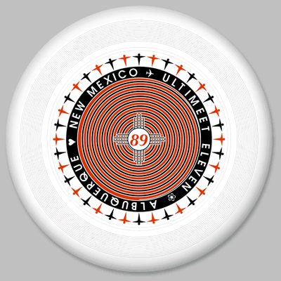
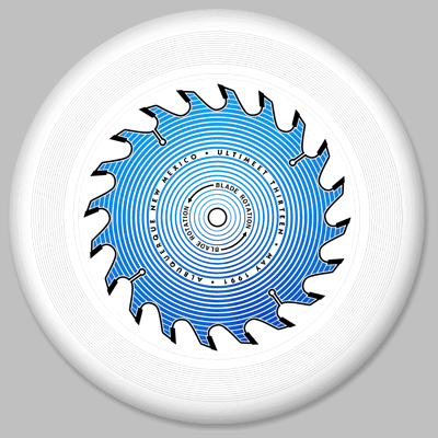
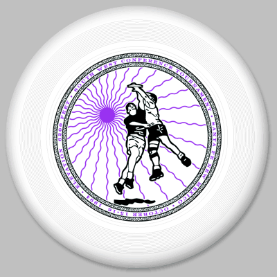
Ultimeet 11
1989
This is the first disc design i did with my friend Eric Edgerton, and one of the first designs i did on my Mac. Eric's design from the year before used the little "flying men" on it so we used the same figures around the outside of this disc.
200 printed:
- white/red on black
- red/light blue on yellowish green
- black/red on white
|
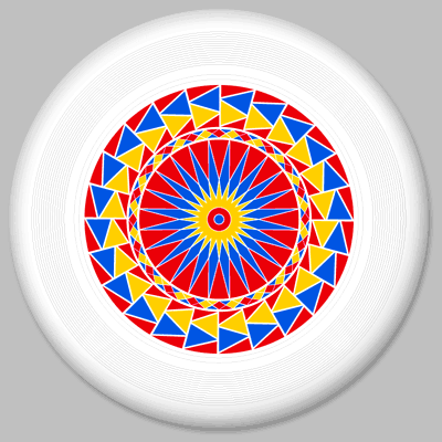
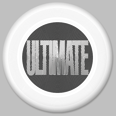
Rainbow Disc
1989
I made this disc design to see if i could get a rainbow effect when the disc is spinning.The white discs were printed in primary colors and when they were spinning, the varying amounts of the three different colors on concentric levels had a blending effect, creating a quasi-rainbow of colors.
200 printed:
- yellow/blue/red on white
- yellow/blue/red on yellow-green
- brown/orange/red on blue
|
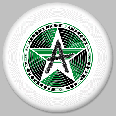
Aerodynamic Anarchy
1990
This was made for no reason other than i had a good design and the team needed some discs. It was a little tricky for Discraft to print due to the extreme narrowness of the triangles coming off the edges of the star. They did a good job though. This is one of my favorite disc designs.
200 printed:
- black/metallic green on white
- blue/white on hot red
- black/yellow on blue
|
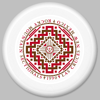
Rocky Mountain Sectionals
1990
I made this design for the 1990 Rocky Mountain Sectionals in Las Cruces. I didn't actually go to that tournament because i had to fly with my nephew Charlie to Philadelphia. The design stemmed from some design ideas i was playing with. The tournament directors (Charlie Aguirre and Dave Million) just asked if i could add the 3 crosses in the middle for Las Cruces.
This disc has my name and old address on it in morse code around the outside edge.
200 printed:
- brown/red on white
- black/white on blue
- black/blue on orange
|
Albuquerque Ultimeet 13
1991
I'd had this design sitting around for a while and we needed a disc design for the 1991 Ultimeet.
200 printed:
- black/metallic blue on white
- metallic blue/silver on pink
- metallic blue/silver on orange
|
Big Ultimate
1992
This was made for the same reason as the Anarchy Disc. I had this design sitting around for a few years and Bruce Hopper saw it and put up the money to have them printed up. Discraft shipped them to a Kinko's in Boulder, where Bruce picked them up around midnight the friday before the Boulder 4th of July tournament.
200 printed:
- black/silver holographic on white
- red/black on white
|
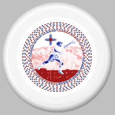
Jose Cuervo Qualifier
1992
This was the tournament disc for the Albuquerque Cuervo ultimate tournament in July of 1992. The featured player is Bone Dexter, taken from a photo i took in practice one day, and laid on top of a photo of the Sandias. The diamonds around the outside are spaced differently so that when this disc is spun under flourescent lights, the rings of diamonds appear to slow down and spin backwards at different speeds.
200 printed:
- red/blue blue on nightglow
- orange/yellow on UV purple
- purple/pink on white
|
Jose Cuervo Qualifier
1993
This was the tournament disc for the Albuquerque Cuervo ultimate tournament in July of 1993. Ugly ugly design, but we eventually got rid of them.
200 printed:
- pink/light blue on white
- black/silver on hot red
--!!!!!--
I just discovered (May 2007) that i do NOT have a white copy of this disc! If ANYONE has one of these discs in white in ANY condition, PLEASE let me know!
|
Southwest Conference
1994
This was the tournament disc for the Southwest Conference Tournament (this was the year that the West Region was split into two conferences) in Santa Fe, NM in 1994. The image on the front was taken from a photo i took at the Albuquerque Ultimeet of that year and features Jaben of Santa Fe catching the disc over a Dallas player.
300 printed:
- metallic blue/light purple on yellow-green
- black/light purple on white
- black/white on orange
|
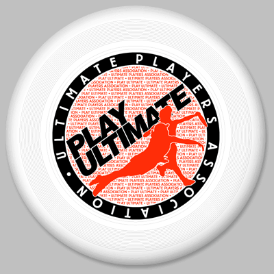
Play Ultimate
Ultimate Players Association
1994
The design on this disc was derived from the Ultimate Players Association membership bumpersticker design, which i also did. The print pictured here was VERY hard for the makers of the discs, Discraft, to imprint on, so later versions were altered to break up the image somewhat.
Hundreds printed:
- black/copper on white
- black/metallic purple on white
- metallic green/metallic blue on yellowish-green
- green/white on orange
- white/metallic purple on pink
|
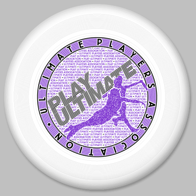
Play Ultimate (revised)
Ultimate Players Association
1995
And here's the later version. I had to stipple the large silouette images and chop the outer circle into thinner lines.
Hundreds more printed: lots of colors
|
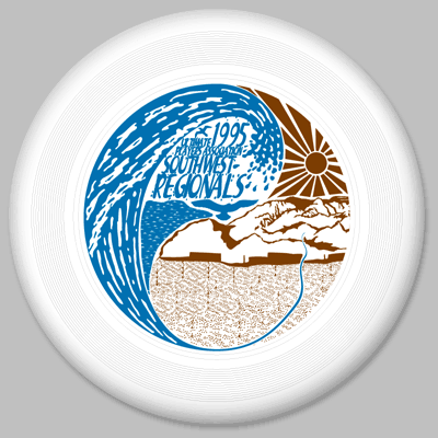
Southwest Regionals
1995
The tournament director for this tourney got my name from UPA headquarters as someone who might be able to design a disc. I came up with about 8 different possible designs and the tournament director liked this one the best, although it was probably my least favorite of the lot.
200 printed:
- black/copper on white
- black/brown on white
- white/red on UV purple
- silver/metallic purple on green
|
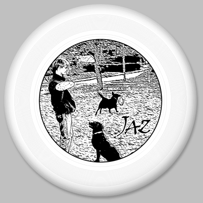
Jaz
1996
This disc design came from two photographs supplied to me by my friend Will Starr. Will made this disc to commemorate his dog Jaz, who passed away in the summer of 1996.
100 printed:
- black on white
- purple on green
|
Albuquerque Ultimeet 19
1997
Quickie disc design for Albuquerque Ultimeet 19. I called Discraft to make sure that thay could get them printed by the tournament, then did the design that day and Fedexed it to them. I like the way the texture came out on this one.
125 printed:
- Black/Copper on white
- Metallic Blue/Yellow on green
|
Albuquerque Ultimeet 21
1999
I was out of ideas, so came up with this sphereized design with the little Ultimeet 21 logo on it. Not bad, but this is the first time that i've been disappointed with Discraft's printing job. They trimmed the artwork a bit so that the colors wouldn't be so close to each other, but in the process trimmed a little TOO much. They also skimped on the print color selection. Ah well.
200 printed:
- Red/Metallic Blue on white
- White/Metallic Blue on green
- White/Metallic Blue on orange
|
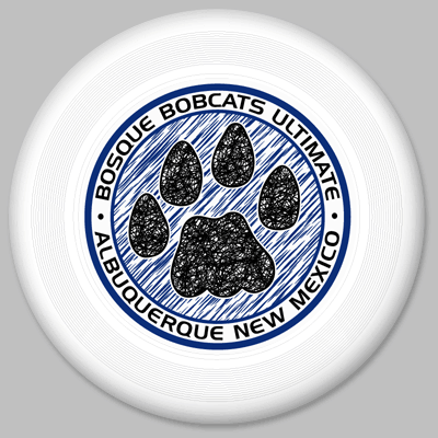
Bosque Bobcats
2001
My friend and fellow ultimate player Bobbo McCormick is a teacher at Bosque Prep in Albuquerque. He had me design this disc for them and had them printed up. He was pleased that i used an actual bobcat pawprint instead of the bad coyote-track that the Bosque Prep office keeps using.
100 printed:
- black/blue on white
- black/blue on green
- black/blue on orange
|
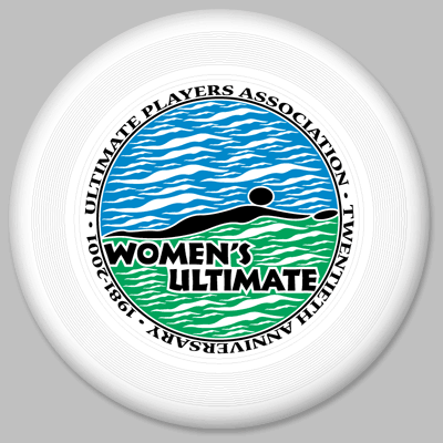
Women's Ultimate
2001
This design came out of the Women's ultimate design that i did for the UPA. (That won me a free year of UPA membership.) The shape of the diving woman in black is the same shape used in the sky and ground, just at varying sizes. Kinda nifty. I only got 2 of these discs, but at least i got those.
1,000 printed (i think):
- black/metallic blue/copper on white
- black/blue/metallic green on white
|
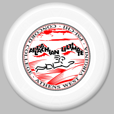
Concord College
2002
Rod Klein asked me to help him with a disc design for Concord College in Athens, WV. He had a basic idea and i collaged together some clip art and drew the diving figure.
100 printed:
- black/red on white
- black/red on UV purple
- black/red on blue speckled
|
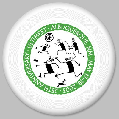
Ultimeet 25
2003
I submitted a lot of designs for this tournament (which i didn't attend) including a really cool one that looked like an I-25 highway sign, but they chose this one.
I don't know how many they printed:
- black/metallic green on white
- black/metallic green on yellow
- metallic blue/black on orange
|
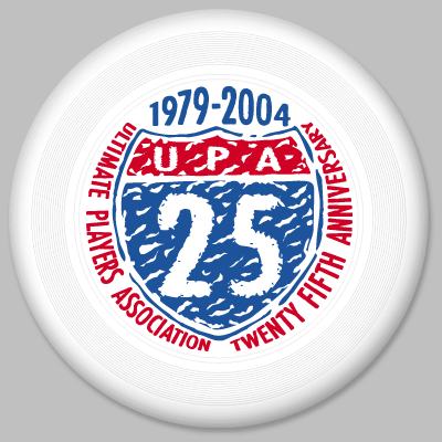
25th Anniversary
Ultimate Players Association
2004
I submitted a whole bunch of designs for this disc, one of them being the I-25 road sign design that i'd also submitted for the Ultimeet 25 disc. I was happy that the UPA folks chose it, but then i had to tweak it a bunch and add in some type, so i was a little leery about how it would turn out. To my delight, when i finally got the printed discs, they looked great!
Don't know how many were printed:
- metallic red/metallic blue on white
|
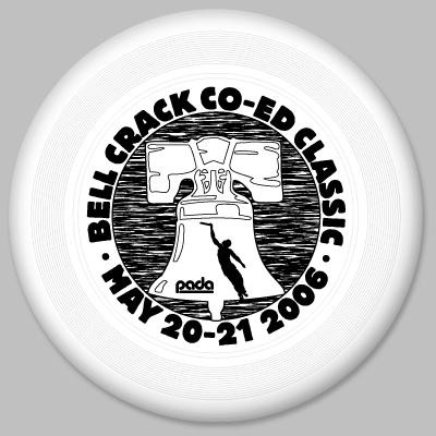
Bell Crack Co-ed Classic
2006
I had submitted a bunch of designs for the PADA (Philadelphia Area Disc Alliance) Summer League and one of them used this liberty bell idea. One of the PADA people was running the Bell Crack tournament and asked if i could modify the design for their discs. Apparently they were quite popular.
I don't know how many were printed, but they were all black on white.
|
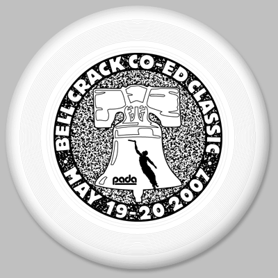
Bell Crack Co-ed Classic
2007
The Bell Crack tournament people asked me to redesign their logo for the 2007 tournament. At first they weren't going to print any discs, but i talked them into it.
I don't know how many were printed, but they were all black on white.
|
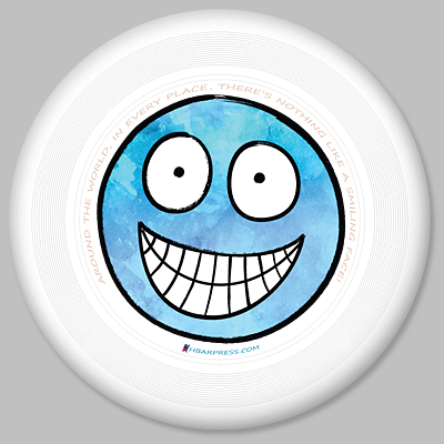
Smiley-Face
2017
My first foray into Discraft's full-color printing instead of the hot-stamp process of all my other discs. I'd been wanting to make another disc for a while and decided to have some made in conjunction with my book "The Smiley-Face Book."
I ordered an initial run of 35 discs.
|
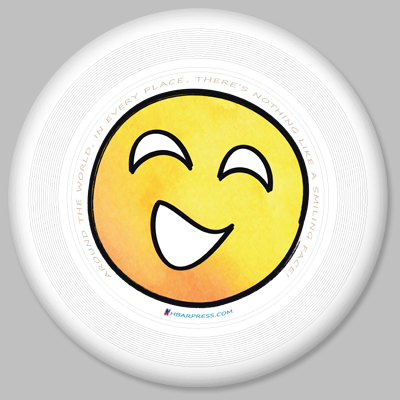
Smiley-Face Yellow
2019
I sold out of my first smiley-face disc, so ordered some more, this time with a different face from "The Smiley-Face Book."
Ordered another 35 discs.
|