In Love With FlyingKenneth W. Ford6/2007My father decided to self-publish this book and i did all of the design and layout for it. The cover photo was taken by me at Harris Hill in Elmira, New York. I had to do some editing work on it to move the glider to the right so that all of it would be on the page. The background of the back cover is an aeronautical chart of New Mexico. |
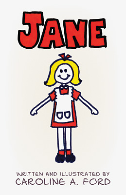
JaneCaroline A. Ford11/2011I scanned in and cleaned up all of the pages from Caroline's original booklet that she had made in the 1970s. Then i recreated Caroline's hand-drawn lettering as a computer font to use throughout the book. |
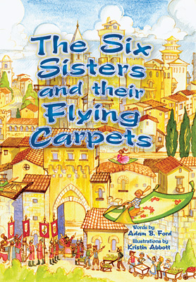
The Six Sisters and their Flying CarpetsAdam B. Ford11/2012My first published book, although not the first children's book that i've written. All of the illustrations were done by Kristin Abbott and i placed them all on the page and added the type. The cover image is the same as one of the interior spreads, just flipped left/right. |
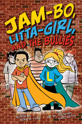
Jam-Bo, Litta-Girl, and the BulliesAdam B. Ford9/2013I wrote this book after publishing The Six Sisters and their Flying Carpets, specifically for the drawing style of Courtney Huddleston. Courtney provided the artwork in black-and-white and i did all of the coloring and compositing, as well as the typography and layout. I chose comic book style fonts for the lettering. |
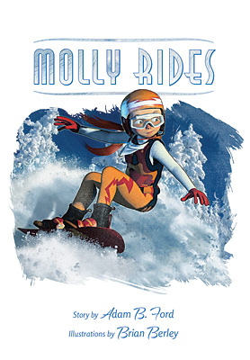
Molly RidesAdam B. Ford2/2014Close on the heels of Jam-Bo came this book, which i'd had for a while. I asked my friend Brian Berley to do the illustrations. I'd worked with him at Siren Interactive in Chicago and he agreed to take this on as his first children's book. |
Building the H Bomb - A Personal HistoryKenneth W. Ford3/2015I started the design and layout work on this book when it was intended to be self-published. After Ken struck a deal with World Scientific to print it, i was retained as designer and layout artist. The cover is a colorized version of a scan of the original document that Stan Ulam and Edward Teller presented when looking into the feasability of a thermonuclear device. |
Big CatAdam B. Ford12/2015I had asked my friend Chrystal Cleary, with whom i worked at the Okemo Signshop, to do the illustrations for this book as her specialty was animals and this was my first book that had non-humans as the main characters. She agreed, and it took a while, but we eventually got going and got it done. The cover background is a scan of a piece of rough paper, colorized and manipulated. I also made a rough-drawn font to use in this book. |
Basic PhysicsKenneth Ford10/2016My father had his 1968 textbook scanned and OCR'd with the intention of re-releasing it. I convinced him that it really needed to be re-typeset as well and i spent many hours laying out the scanned text and graphics into Adobe InDesign. The OCR process basically missed all of the greek characters, many of the subscripts and superscripts, and garbled most of the formulas. It was quite a task. At the end, once Ken struck a deal with World Scientific, i also redesigned the cover, based on the original covers (there were a few different ones). |
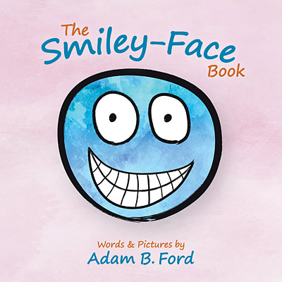
The Smiley-Face BookAdam B. Ford5/2017This is the first book that i illustrated myself. The watercolor backgrounds are all clipart which i recolored. The lines are Adobe Illustrator brush patterns. I chose a purple background because none of my other books had been purple yet. |
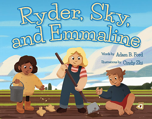
Ryder, Sky, and EmmalineAdam B. Ford8/2020Beautiful illustrations provided by Cindy Zhi, an artist from Australia. My one quibble is that i wish that the background landscape wasn't so flat, but i'd already asked for a couple other changes on the artwork, so i let that one go. The font used is called Life Savers and has a nice relaxed schoolbooky feel. This was the first time that my self-publishing company allowed landscape-format color books, so i was excited to have a picture book be in a traditional picture book format. The paperback versions felt a little flimsy, though. |
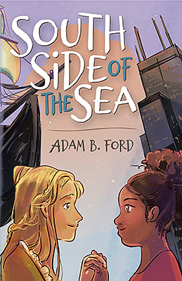
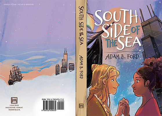
South Side of the SeaAdam B. Ford4/2022I hired Aliana Wong to do the cover art and was, overall, a little underwhelmed. The final artwork was good, but the front and back covers didn't blend into each other very well, so i ended up putting a parchment-like graphic all along the spine, but then the printing company, in trying to keep the edge of the parchment off the front, shifted everything so that the text on the back was right up against the outside edge of the book. Aliana's artwork felt a little pastelish to me, so i increased the saturation a little, then blended in a NASA photograph of deep space stars into the background. I left that effect light on the slipcover, but enhanced it on the printed cover of the book itself. I'd come up with the title lettering long before i'd seen any artwork and was able to fit it into Aliana's design nicely. |